Volunteer-facing mobile experience · concept and interactive prototype
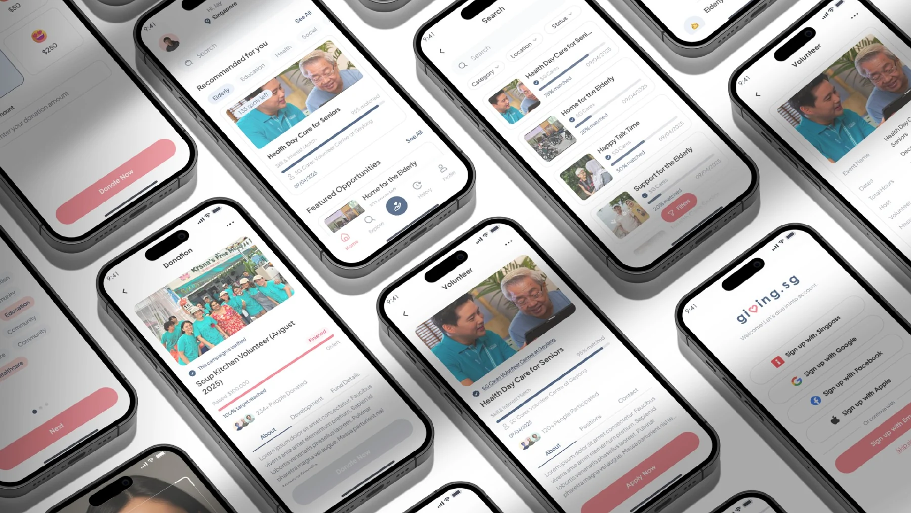
A connected experience across discovery, application, and participation. Prototype screens from my project deck.
01 / Context and research
A volunteer's decision is bigger than a search result.
Giving.sg brings together volunteering opportunities from different organisations. The challenge was to make a role feel relevant and actionable without losing context between browsing, sign-in, application, and follow-up.
49/81survey respondents selected opportunities that match their interests as a motivator.
48/81selected insufficient role detail as a barrier to volunteering.
37/81selected unclear application or sign-up steps as a barrier.
Counts recalculated from the supplied 81-response survey export. Questions allowed multiple selections; these are signals from this sample, not population estimates.
Triangulating the evidence
What the research changed
Survey → prioritise role clarity
68 of 76 respondents rated clear information about roles quite important or crucial. I brought time, location, requirements and responsibilities closer to the choice to apply.
Interviews → preserve intent
Eight volunteer interviews exposed the cost of uncertainty. One participant described losing their place after sign-in and being unsure whether an application had gone through. The proposed journey keeps the chosen role in view.
Flow review → connect the service
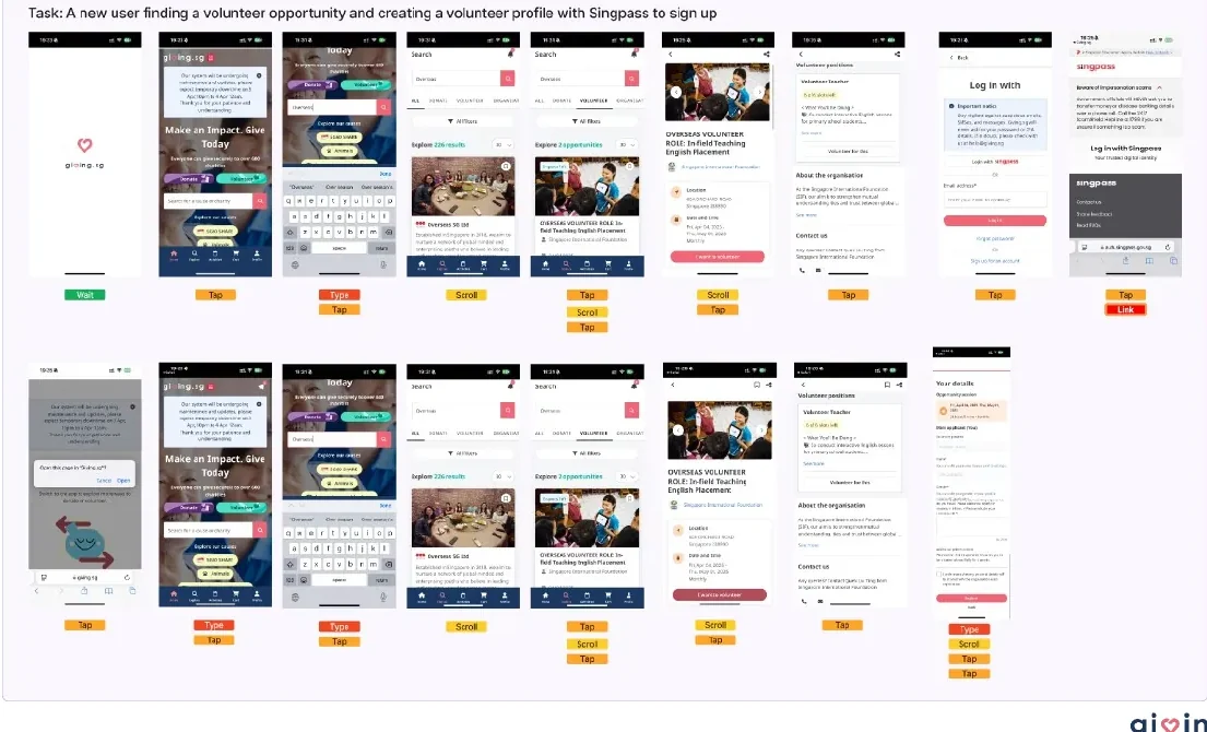
Reviewing the original search, details, and login flows revealed handoffs where people had to reconstruct context. I prototyped a continuous path from finding a role to tracking participation.
A screen-by-screen baseline from the project deck. Open the artifact to inspect the details.
02 / Problem → decision / Discoverability
Help people judge a role before they commit.
Discoverability is more than a search box: people need to compare a role with their interests, skills, schedule and location.
Evidence
49/81 selected interest fit as a motivator; 48/81 flagged missing role details. Interviewees also asked for clearer fit and commitments.
Design decision
Introduce interest and skill preferences, clearer filters, and visible match cues; keep essential role requirements in the details view.
Why it matters
Users can eliminate poor fits earlier while still seeing the real requirements, instead of trusting an unexplained match label.
Before · Original searchBroad browsing, with fit and practical details scattered across subsequent steps.After · Proposed discoveryPreferences and role cues make the next decision clearer, while the detail page exposes the commitment.
Trade-off: Rather than promise that an algorithm knows the “best” role, the prototype shows visible interest and skill cues that a person can verify against role details.
03 / Problem → decision / Continuity
Don't make sign-in erase the reason someone came.
The volunteer journey breaks if an account step returns someone to the beginning or leaves the application state unclear.
Evidence
37/81 respondents selected unclear sign-up steps. An interview participant described returning to the homepage after authentication without knowing whether they were registered.
Design decision
Prototype a simple preference-setting entry point and a sign-in route that stays connected to the selected opportunity.
Why it matters
The account step should support the volunteer's current task, not compete with it. Authentication continuity remains a product requirement to validate with engineering.
Before · Original login routeAuthentication interrupts the volunteering task; interview feedback surfaced uncertainty after returning.After · Proposed onboardingThe prototype asks about skills and interests, then enters a tailored experience. End-to-end login persistence is a proposed requirement, not a tested integration.
04 / Problem → decision / Application
Make the commitment and next step unmistakable.
Finding a promising role only helps if someone understands what applying involves and sees a clear result.
Evidence
Survey respondents flagged both role detail and sign-up clarity; review of the original journey showed information and action separated across screens.
Design decision
Place the application action after role context, simplify the form sequence, and surface a completion state with a route to “My Events.”
Why it matters
The volunteer can decide with more context and knows where to check the application afterward.
Before · Original role detailWatch how the existing listing leads toward sign-up and where supporting details appear.After · Proposed applicationRole context, application form, confirmation and the next place to check progress are shown as one flow.
05 / Problem → decision / Follow-through
Design beyond the submit button.
Volunteers need to know what happens after an application and what participation they've completed.
Evidence
Interview synthesis surfaced requests for follow-up and recognition, including participation records. These needs varied between volunteers rather than applying to everyone.
Design decision
Prototype “My Events” with status, event history, and a completion certificate route for the people who need a record.
Why it matters
A visible status reduces ambiguity and gives return visits a useful purpose. Issuing verified records would require organiser and platform operations.
Before · Original browsing pathThis captured baseline shows browsing only; it does not document the old post-application status experience.After · Proposed participation viewA proposed home for upcoming activity, past participation and downloadable completion records.
06 / Design system and delivery
One interaction language across the journey.
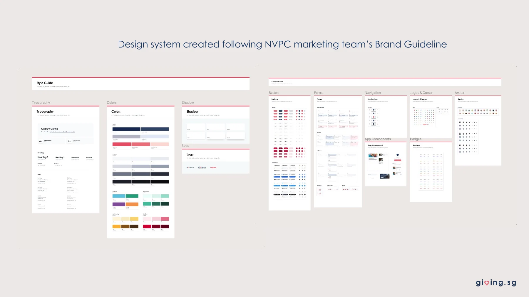
I translated the organisation's brand guidance into mobile foundations, form patterns, navigation, states and reusable components. This made the four flows feel like one product and gave the prototype consistent rules for later iteration.
The same component rules can guide AI-assisted exploration; I review generated screens against the system and the interaction intent. Before shipping, I would specify validation, responsive states and edge cases with engineering.
Brand foundations and reusable UI from the original project deck.
07 / Prototype validation
A promising pilot, with clear limits.
8 → 3 min
Average completion time reported in the project deck for a task tested with five participants on the original and redesigned prototype flows. Small-sample prototype result; not a live-platform outcome.
What I would measure after implementation
Leading signals
Role comprehension, task completion, form drop-off and confidence after applying.
Longer-term signals
Completed applications, confirmed participation, return use and support contacts about status.
Reflection
The next constraint is the service behind the screen.
The prototype shows how research can connect four broken moments into a clearer volunteer journey. Its success would still depend on accurate organiser listings, reliable authentication handoff, trustworthy status updates and a tested path to issue records. Those are the first assumptions I would validate with the product and engineering teams.